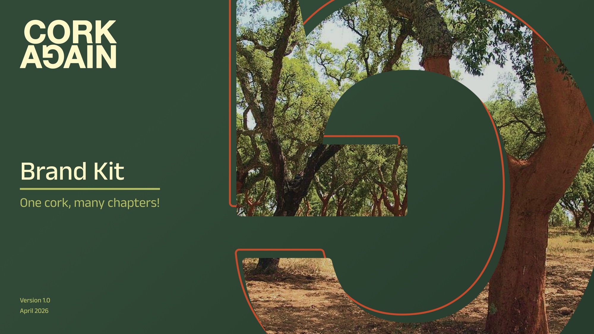
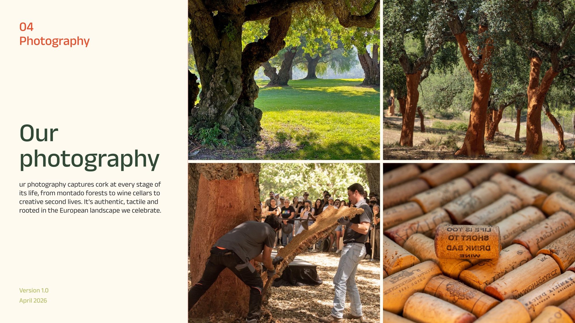
Cork Again is an educational project telling the story of cork across Europe, from the Mediterranean montado forests to the bottle, and into the many second lives wine corks can live through reuse and recycling.
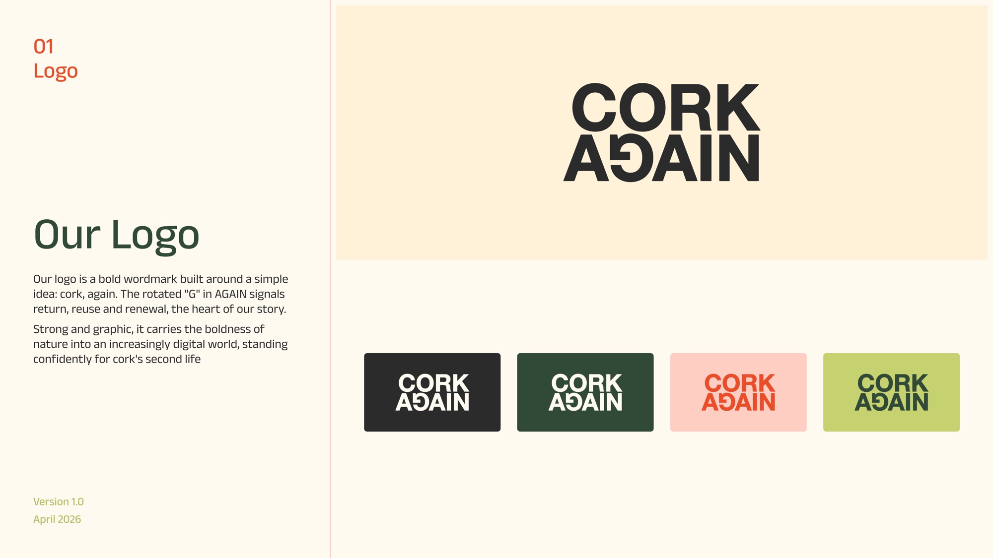
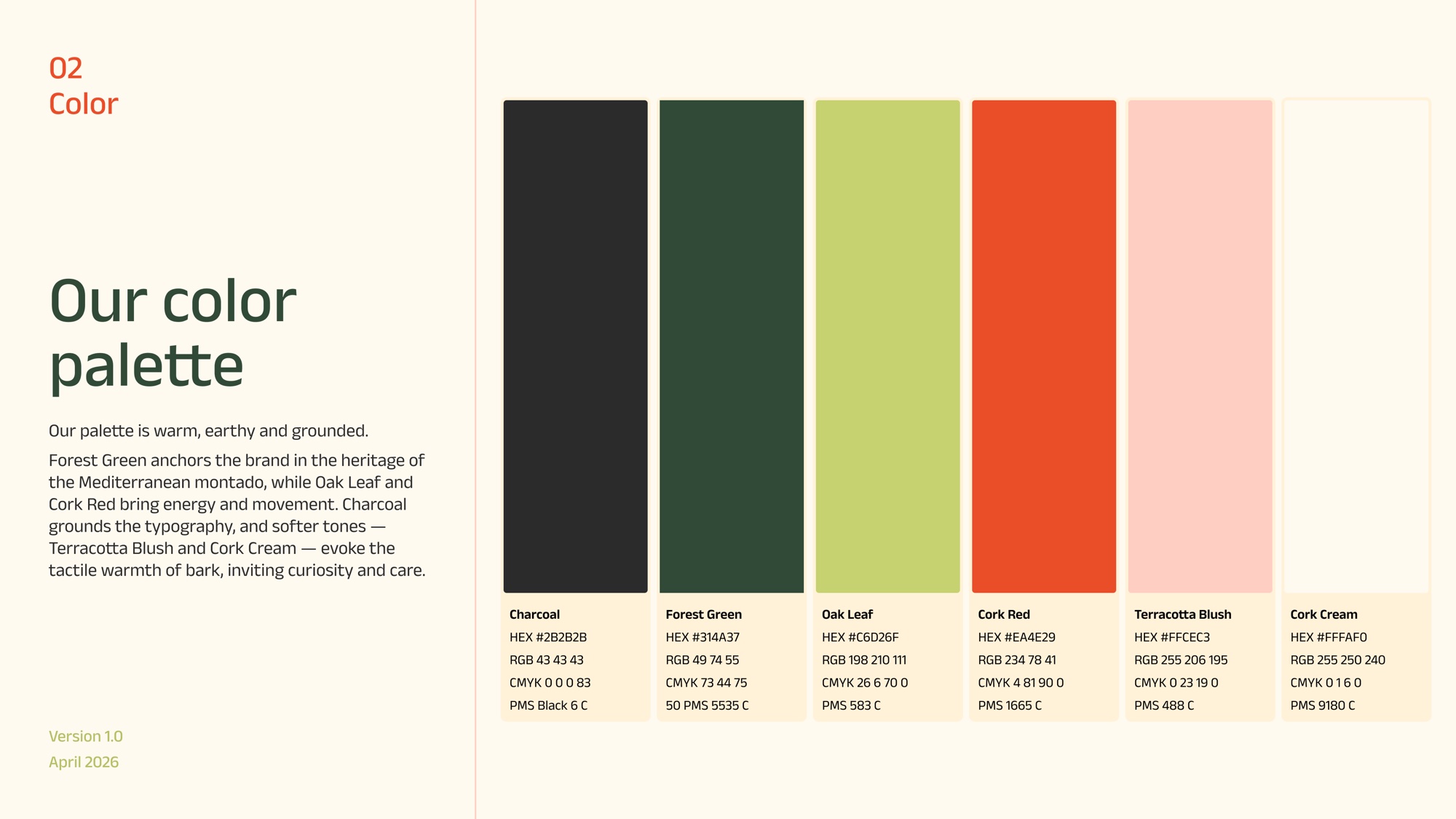
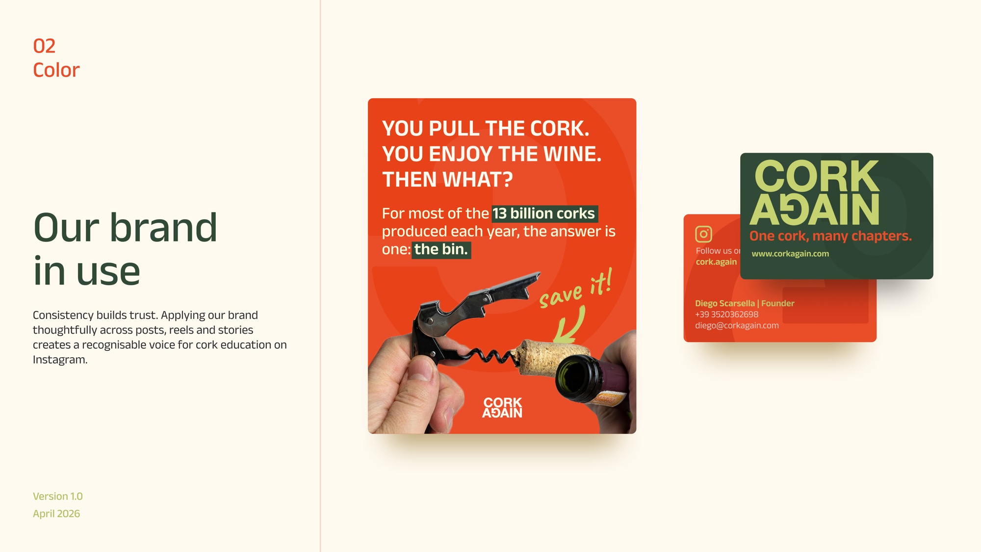
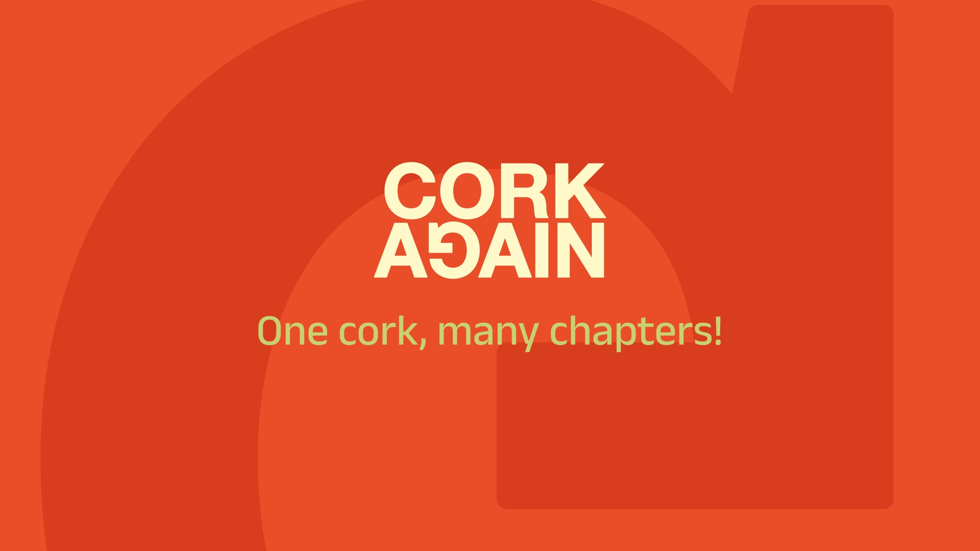
The logo is a bold wordmark built around a simple idea: cork, again. The rotated G in AGAIN signals return, reuse and renewal, standing confidently for cork's second life. The broader identity is warm, earthy and grounded, with Forest Green, Oak Leaf and Cork Red bringing nature into a digital world.
A brand built to inspire awareness, participation, and a more conscious relationship with the materials around us.